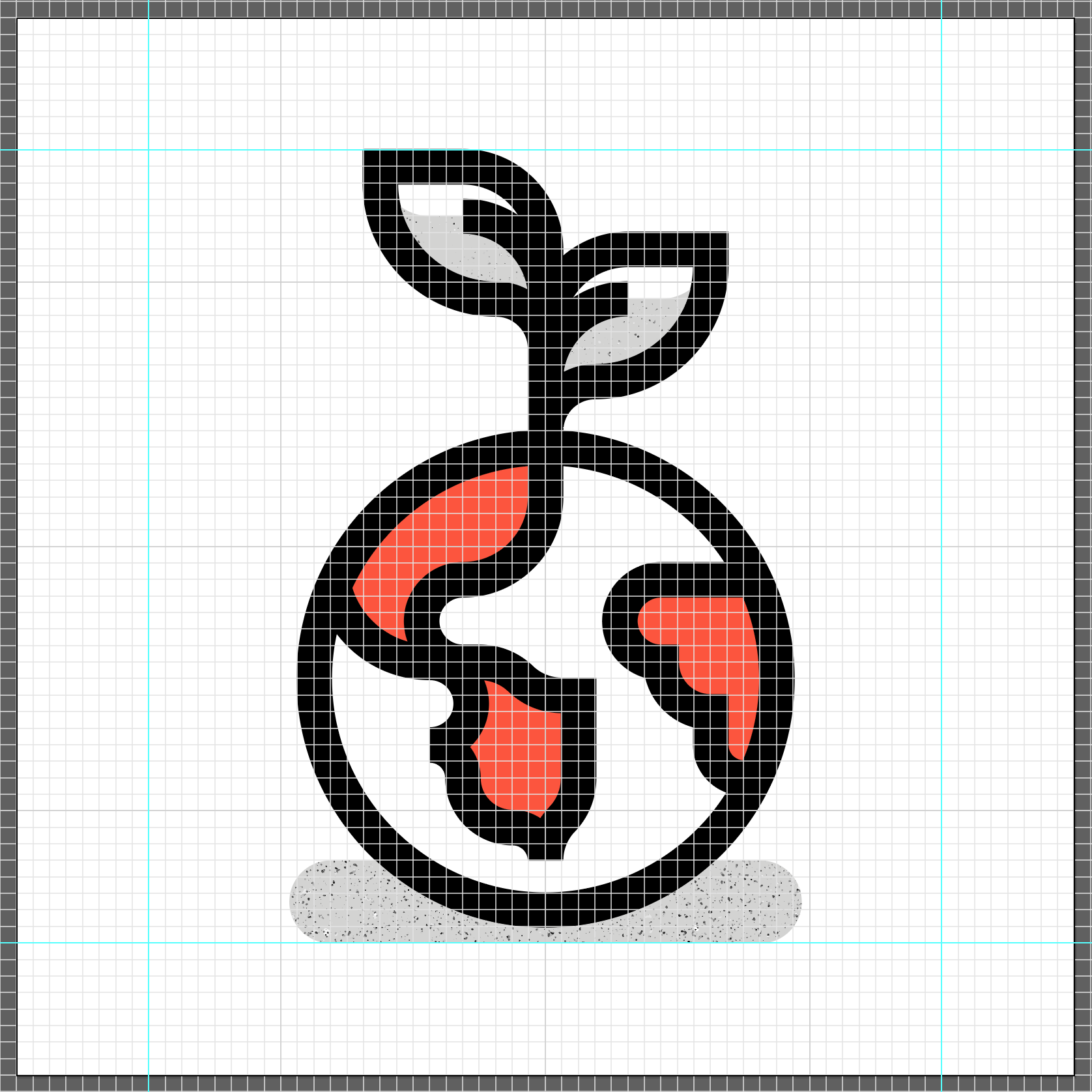
Iconography was an important part of Spin’s brand expression and had the following specs:
* Iconography was created on a grid for consistent spacing
* White, Black, & Light Gray make up the majority of the iconographic shapes with the addition of Orange highlights for impact. Light Gray is most often used for solid fills, and sometimes as back shapes for grounding
* A consistent line weight (12.5pts) is applied across all icons
* Sharp edges are preferred when applicable. Round corners are acceptable when elements require a curve or has an organic shape


Whenever possible I tried to inject my icons with extra meanings. Sometimes it’s by using a wheel as a lock hole—or an exclamation point as rain—or a scooter handle as a mailbox flag.
Note: A flecked light gray texture was used in the early iconography but later removed to create lighter-weight assets
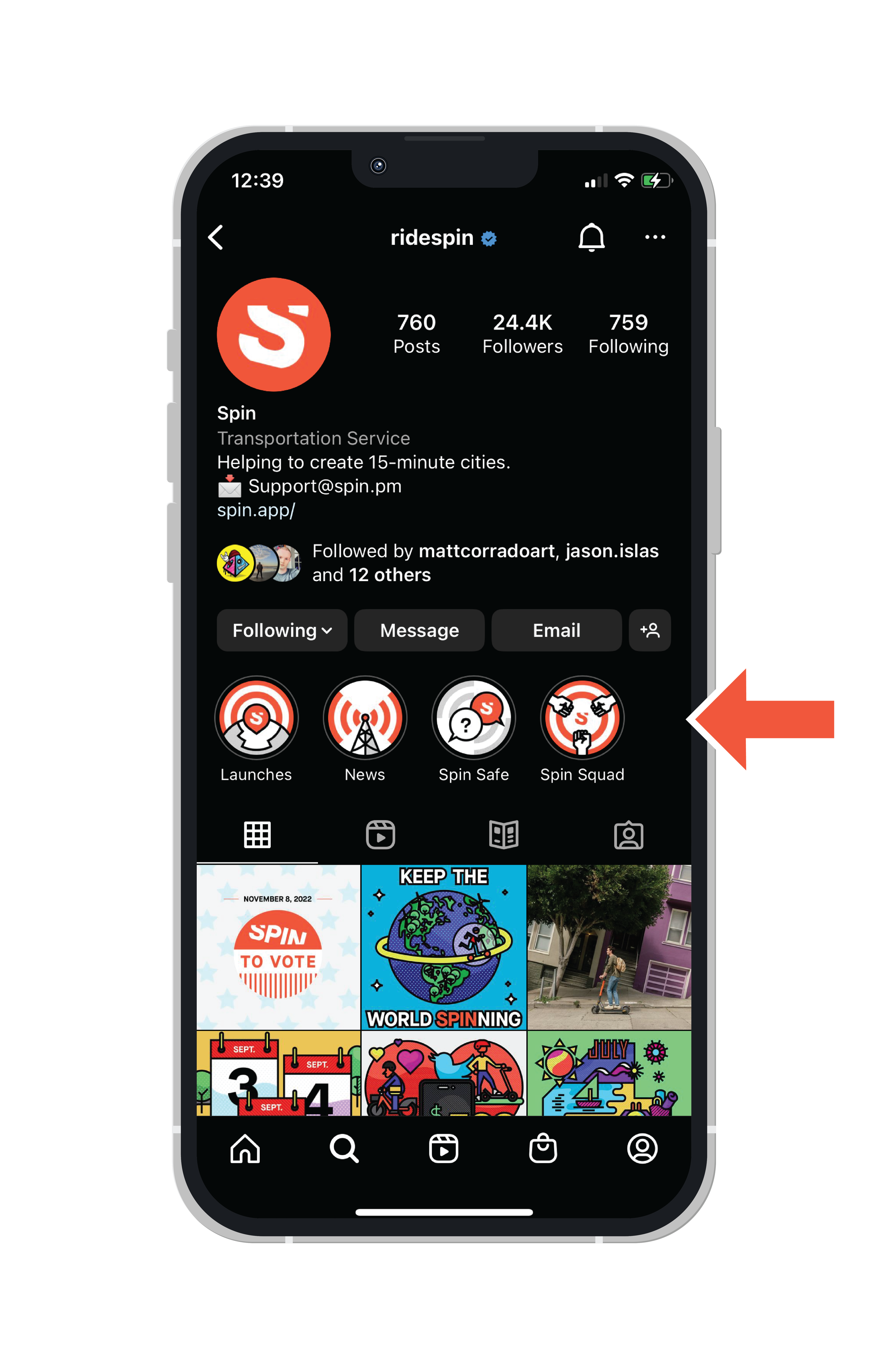
Instagram Covers
…which is why I also happen to dig these Instagram covers. They are consistent and unified in their use of a circular background design pattern that sometimes is meant to support the focus of the icons (when in orange), and sometimes is the background shape (when in gray).
Sometimes this circular pattern represents sound, sometimes light. Sometimes it is a signal, and sometimes it is a symbol of unity. Clever design to me is figuring out the different ways this shared design element can convey something different for each, depending on its context.